
Most “AI art prompts” online are built for quick novelty, not for real wall art. The difference matters. A print hangs at eye level, gets seen every day, and has to hold up in a frame at 50–100 cm wide. That’s why the best prompts for wall art have three goals: clear composition, cohesive style, and print-friendly detail. In this guide, you’ll get ready-to-copy prompt templates that consistently produce results that look premium, plus practical steps to turn the best generation into a framed print you can order with confidence.
If you’re new to the workflow of generating and printing, start here first: How to create stunning AI wall art (beginner’s guide). And once you have an image you love, use Choosing the right size and frame for your wall art to get the physical piece right.
Why “Expensive-Looking” AI Wall Art Is Mostly About Constraints
High-end art almost always shows restraint. It has an intentional palette, a clear focal point, and controlled texture. The quickest way to make AI generations look cheap is to ask for too much at once: ten subjects, every art medium, hyper-detail, and “8K” buzzwords. Instead, your prompt should constrain the outcome:
- One subject, one mood. A single idea reads as deliberate at large size.
- One style direction. Don’t mix “watercolor” + “oil paint” + “cinematic” + “3D render.” Pick one.
- One palette. Two to four dominant colors is a sweet spot for interior-friendly prints.
- One composition note. Say “centered,” “rule of thirds,” “negative space,” or “minimal” so the AI doesn’t clutter the frame.
The Prompt Formula for Print-Ready Wall Art
Use this formula as a base and swap the bracketed sections:
[Subject], [medium/style], [palette], [lighting], [composition], [texture/detail level], [mood], [aspect ratio].
Example:
“Abstract ocean waves, minimalist oil painting on canvas, muted blue-grey palette, soft diffuse light, horizontal composition with generous negative space, subtle brush texture, calm mood, wide aspect ratio.”
Prompt Templates (Copy, Paste, Customize)
Below are templates designed for wall art. Replace the words in brackets with your choices. If you want these prints to feel cohesive across a room, reuse the same palette and style across several prompts to create a “series.”
1) Minimal Abstract (Modern, Interior-Safe)
“Minimal abstract composition of [shape motif], [medium], limited palette of [color 1], [color 2], [neutral], soft gradients, generous negative space, calm mood, gallery-ready, horizontal composition.”
When to use: living room, above a sofa, modern/Scandi interiors.
2) Landscape That Feels Like a Gallery Print
“Atmospheric landscape of [place type: coastal cliffs / alpine valley / misty forest], [style: fine art photography / oil painting / watercolor], muted colors, soft morning light, minimal human elements, layered depth, cinematic but subtle, print-ready, [horizontal/vertical] composition.”
3) Botanical (Soft, Timeless)
“Botanical illustration of [plant type], clean background, delicate linework, gentle shading, warm neutral palette, Scandinavian minimal style, lots of breathing room, vertical composition.”
4) Architectural Minimal (High-End, Editorial Feel)
“Minimal architectural scene, [material: concrete / stone / plaster], geometric shadows, warm sunlight, monochrome palette, clean lines, calm mood, fine art photography style, negative space, vertical composition.”
5) Textural Monochrome (Looks “Designer”)
“Monochrome abstract texture, [material: linen / plaster / paper], subtle relief, soft side lighting, extremely minimal, gallery wall art, quiet luxury aesthetic, high contrast but restrained, square composition.”
6) Color Block / Bauhaus-Inspired Geometry
“Geometric color block composition, Bauhaus-inspired shapes, clean edges, limited palette of [color 1], [color 2], [neutral], balanced spacing, minimal texture, modern poster design, horizontal composition.”
7) Calm “Hotel Lobby” Art (Neutral, Elevated)
“Elegant abstract landscape suggestion, warm beige + soft grey palette, gentle haze, minimal forms, soft lighting, premium wall art, modern luxury interior style, wide composition, negative space.”
8) Dramatic Black & White (Bold Statement)
“Black and white fine art photography of [subject: waves / mountains / modern architecture], strong composition, deep blacks and soft highlights, minimal clutter, editorial gallery print, [vertical/horizontal].”
9) Surreal but Still Hangable
“Surreal scene: [simple surreal element], minimal background, cohesive palette, soft light, painterly style, calm mood, strong focal point, lots of negative space, gallery-ready print.”
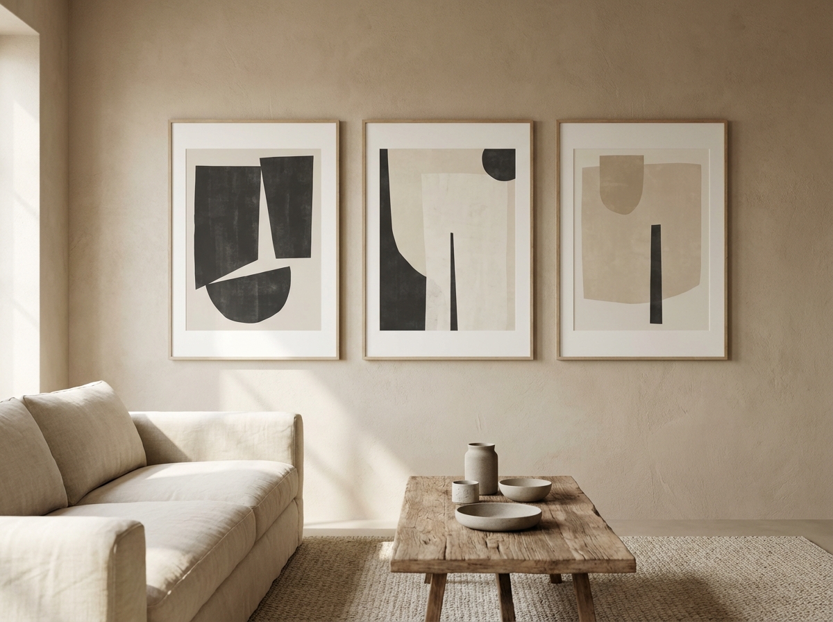
10) “Set of Three” Cohesive Series
“Create a cohesive set of three abstract artworks: same palette of [colors], same medium [medium], each with unique composition, minimal style, negative space, designed as a matching triptych for a gallery wall.”
Negative Prompts (What to Avoid for Wall Art)
Wall art needs clarity. If your generations keep coming out busy, messy, or “AI-ish,” the fastest fix is to tell the model what not to do. You don’t need a huge “negative prompt”—just a short avoid-list that matches your style. Here are common culprits that make prints feel cheap:
- Clutter: too many objects, background details, text-like shapes.
- Over-sharpened edges: “crispy” halos around shapes can look harsh when printed.
- Random typography: AI-generated “fake text” looks fine at small size and awful on a wall.
- Overly complex lighting: multiple light sources can break realism and mood.
- Chaotic color: too many saturated colors makes a room feel noisy.
Try appending a simple line to your prompt like: “avoid clutter, avoid text, avoid watermark, avoid busy background, avoid harsh sharpening.” The goal is not to censor creativity—it’s to keep your print calm, readable, and intentional.
Before/After Examples: How Small Edits Make a Huge Difference
If your prompt is close but not quite “gallery,” don’t rewrite it from scratch. Make small changes that steer quality:
- Too busy → add: “generous negative space, minimal background, single focal point”
- Colors don’t match your room → add: “limited palette of [2–3 colors] + neutral”
- Looks like a stock image → add: “fine art print, editorial composition, subtle texture”
- Flat and boring → add: “soft side lighting, subtle relief texture, gentle contrast”
For example, compare:
Before: “abstract mountain landscape, modern art.”
After: “minimal abstract mountain landscape, muted blue-grey + warm white palette, soft fog layers, gentle morning light, wide composition with negative space, subtle paper texture, calm mood, fine art print.”
The “after” version gives the AI a specific palette, lighting, texture, and composition—exactly what makes wall art feel expensive.
Prompt Packs by Room (Quick Wins)
If you want prompts that reliably suit specific rooms, use these mini packs. They’re designed to produce art that “belongs” without dominating the space:
- Bedroom: “soft abstract landscape, warm neutrals, low contrast, calm mood, minimal detail, matte fine art print.”
- Living room statement: “bold minimal abstract, strong composition, limited palette, subtle texture, wide format, gallery-ready.”
- Hallway: “vertical minimalist line art, clean background, lots of negative space, thin charcoal lines, Scandinavian poster style.”
- Home office: “calm geometric composition, cool neutrals, restrained contrast, minimal distractions, modern poster design.”
Want to get very precise with palette so the art matches your decor? Read how to match AI wall art colors to your room and build your prompt palette from your furniture and wall tones.
How to Refine a Prompt (The 10-Minute Iteration Loop)
Instead of rewriting everything, iterate like a designer: change one variable at a time.
- First pass: get the composition right (horizontal vs vertical, negative space, focal point).
- Second pass: lock the palette (two main colors + neutral).
- Third pass: choose texture (plaster/linen/canvas vs clean poster).
- Fourth pass: tune the mood (soft light, calm, minimal).
When you get a generation you love, stop. More changes often pull you away from the magic. Then move into print decisions using our size and frame guide.
Make It Print-Ready: Size, Sharpness, and Upscaling
Printing is where details matter. Large wall art should look clean at arm’s length. If you’re going bigger than 60–70 cm on the long side, read: How to upscale AI images for large prints. That post explains how to keep edges, gradients, and textures smooth at scale.
Turn the Best Image Into a Real Print
Once the image is ready, choose your format, size, and frame, preview it live, and order. If you’re in Europe, delivery is typically a few business days; see European delivery: how long it takes and what to expect.
Legal Note: Can You Print What You Generate?
For personal wall art and gifting, you’re usually fine, but always follow the tool’s terms. For a plain-language overview, read AI art and copyright: what you can print and display.
Quick Checklist (Use This Before You Order)
- Does it look good from across the room? Strong composition beats tiny details.
- Is the palette room-friendly? Two to four dominant colors is ideal.
- Does it have breathing room? Negative space = premium feel.
- Will it hold up at your chosen size? Upscale if needed.
FAQ: Prompting for Prints
Should I ask for “photorealistic” wall art? Only if your room suits photography and your generator is strong at realism. For most interiors, slightly stylized “fine art photography” or “painterly” looks more timeless and hides small AI artifacts better than strict photorealism.
What’s the easiest way to make three pieces match? Keep the same palette, medium, and mood—then change only the composition. If you want layout ideas, use gallery wall ideas and layouts.
Do I need to worry about printing rights? For personal display and gifting, you’re usually fine, but check terms. Our plain-language overview is AI art and copyright.
Next: If you want a cohesive wall, build a set. Start with gallery wall ideas using AI art (layouts and sets) and plan a series that looks curated, not random.

