
AI image generators can produce stunning results—until you print them big. What looks perfect on a phone can reveal problems on a 60 x 80 cm print: soft edges, strange textures, banding in gradients, or tiny “AI artifacts” you never noticed. The good news: you can prevent most of these issues with a simple workflow. This guide explains how to upscale AI images for large prints so your wall art stays crisp, clean, and premium.
If you’re still generating the image, start with prompts designed for wall art: AI wall art prompts that look expensive. Once you have the final file, use choosing the right size and frame to pick dimensions that fit your wall.
First: What “Large Print” Actually Means
Large is relative. A 30 x 40 cm print is often viewed up close. A 70 x 100 cm print is usually viewed from farther away. That changes how much resolution you really need. Instead of obsessing over “300 DPI,” focus on these practical targets:
- Up to ~40 x 50 cm: moderate resolution usually looks fine if the image is clean.
- ~50 x 70 cm and above: upscaling becomes more important, especially for fine art paper.
- Very large statement pieces: treat upscaling as mandatory to avoid softness and artifacts.
Canvas can be slightly more forgiving because texture hides minor softness. Fine art paper is less forgiving; it reveals everything. If you haven’t chosen material yet, read canvas vs poster vs fine art paper.
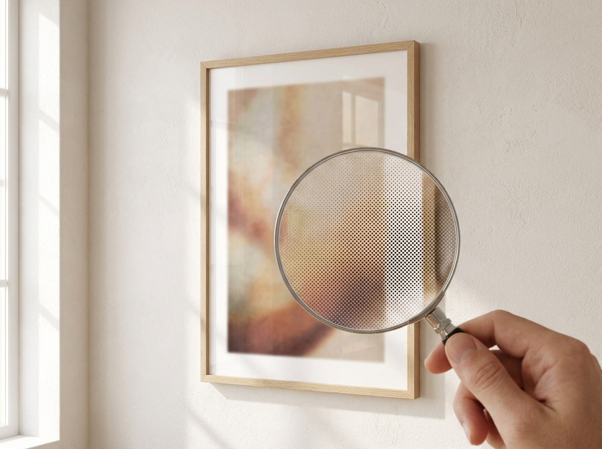
The Most Common Print Problems (and How to Spot Them)
Before you upscale, inspect the image at 100% zoom on a large screen. Look for:
- Banding: visible steps in gradients (skies, soft backgrounds).
- Plastic skin / waxy texture: especially in faces or smooth surfaces.
- Micro-noise: grain that becomes ugly at print size.
- Edge weirdness: fuzzy borders around shapes, messy lines, inconsistent sharpness.
- Text artifacts: AI often invents pseudo-text; avoid it in wall art unless you add real typography later.
If you see these, don’t panic. Many issues improve with careful upscaling and light cleanup—or by regenerating with a cleaner prompt (more negative space, fewer conflicting style words).
A Simple Upscaling Workflow (No Jargon)
Think of upscaling as a three-step pipeline:
- Choose final size and aspect ratio (so you don’t upscale the wrong crop).
- Upscale to a safe resolution for your chosen print size.
- Quality check on a calibrated screen, then order.
Resolution Targets: A Practical Cheat Sheet
You don’t need to think in “DPI math” to get good prints, but you do need a sense of scale. The safest way to plan is to decide your final print size first (see size and frame and sizes by room), then ensure your file has enough detail for that size.
Here’s a practical rule: bigger prints need cleaner files, not just more pixels. If your image is already clean (smooth gradients, no artifacts), moderate upscaling is enough. If your image has visible issues, aggressive upscaling can magnify them.
- Clean minimal abstracts: prioritize smooth gradients and avoid banding.
- Photography-style images: prioritize edge clarity and natural texture.
- Painterly art: prioritize cohesive texture over razor sharpness.
Do a “Print Proof” Before Committing to a Big Frame
If you’re ordering a large framed print, a tiny mistake can be expensive. The professional trick is a proof: either order a smaller size first (if your platform makes that easy) or examine the image as if it were printed. You can simulate this by viewing the image at 100% on a large monitor and focusing on the areas your eye naturally goes to: faces, edges, gradients, text-like marks, and the background.
If the image is for a statement wall, it will be seen from 1–3 meters away most of the time. That means the “distance test” matters: zoom out until the image roughly matches the physical size you plan to hang. If it reads well and feels intentional from that distance, you’re on the right track.
Common Artifact Fixes (What to Adjust in the Source)
Upscaling is not magic. Some issues are better solved by adjusting the prompt and regenerating one more time:
- Banding in skies/gradients: prompt for “soft haze,” “film grain,” or “subtle texture,” and avoid extreme “ultra clean” phrasing. Matte paper also helps (see material guide).
- Waxy surfaces: prompt for “natural texture,” “fine grain,” or “painterly,” and reduce over-sharpening language.
- Busy micro-details: ask for “minimal background” and “negative space.” Wall art needs clarity, not noise.
- Messy edges: simplify composition; fewer objects = cleaner edges.
For print-friendly prompts, use AI wall art prompts that look expensive and keep the prompt constrained.
Color and Light: Why Prints Sometimes Look Different
Every screen is backlit; prints are reflective. That’s why prints can look slightly darker or less “glowy” than on your phone. To avoid disappointment, aim for balanced midtones and avoid super-dark shadow-heavy images unless you know your room has strong natural light. Matte finishes reduce glare but can also soften contrast a touch—often a good trade-off for wall art.
If your interior palette is specific, you can prompt for it directly (see matching wall art colors to your room) so the final print belongs in the space.
Step 1: Lock the Crop Before You Upscale
If you’re printing vertical, crop vertical first. If you want wide, crop wide first. Upscaling a square image and then cropping later can waste detail in the part you keep. For help picking the right orientation for your wall, see size and frame.
Step 2: Upscale With the Right Goal
Your goal is not “max pixels.” Your goal is “looks sharp when printed.” Upscaling too aggressively can create artificial detail that looks crunchy. A good approach is to upscale to the print size you want with some buffer, then avoid repeated upscales.
Practical tip: If your image has soft gradients (sky, haze, minimal backgrounds), prioritize smoothness over ultra-sharpness. If your image has crisp linework (minimal geometry, illustration), prioritize edge clarity.
Step 3: Do a Print Check Before You Order
Use this checklist:
- Zoom test: view at 100% and look at edges, faces, and gradients.
- Distance test: zoom out to simulate viewing from 1–2 meters. Does it read well?
- Artifact scan: check corners and background for weird shapes or repeated textures.
- Frame fit: will any important detail be hidden by the frame border?
When It’s Better to Regenerate Instead of Upscale
Upscaling can’t fix everything. If the image has major issues (distorted hands, messy architecture, inconsistent lighting), it’s often faster to regenerate with a cleaner prompt. Use the prompt templates here: AI wall art prompts that look expensive. Keep the prompt simple, add negative space, and remove conflicting style words.
Material Choice Changes Upscaling Needs
Printing on canvas can hide minor softness; fine art paper reveals it. If you’re unsure what to pick, read canvas vs poster vs fine art paper. If you’re building a gallery wall (multiple pieces), your images should have consistent sharpness and palette; see gallery wall ideas using AI art.
Order and Delivery: What to Expect in Europe
Once your file is ready, order your print and frame, preview it live, then ship. For typical timelines and tracking, read European delivery guide.
FAQ: Upscaling for Wall Art
Is canvas more forgiving than paper? Usually, yes. Canvas texture can hide mild softness and micro-artifacts. Fine art paper reveals detail and imperfections more clearly. If you’re unsure what to pick, see material comparison.
Should I always upscale? If you’re printing medium or large and you care about a premium look, it’s a smart step. Small prints can be fine without upscaling, but large statement pieces benefit the most.
What’s the biggest “tell” of a low-quality upscale? Crunchy edges and artificial texture. If your image starts to look overly sharpened or “plastic,” dial it back and prioritize smoothness—especially for calm minimalist art.
Quick examples: A minimalist abstract with smooth gradients should be checked for banding and noise before printing large. A photo-style mountain landscape should be checked for edge clarity in trees and ridgelines. A line art poster should be checked for crisp lines and clean background. Different styles fail in different ways—and the 100% zoom scan catches them.
Summary: The Practical Rule
To make AI art look premium in large format: lock your crop, upscale once to a sensible target, inspect at 100% zoom, and choose material that suits your style. The result is wall art that looks intentional—not like a screenshot.
If you only remember one thing, remember this: upscaling is the last 10% that protects the first 90%. You already did the hard part—choosing a concept, writing prompts, and picking the best generation. Upscaling and checking for artifacts is what prevents the final print from feeling “almost great.”
Once you see the difference on a framed print, you’ll start treating upscaling as a standard step in your “prompt → preview → order” workflow.
Next: Want a wall that looks curated? Plan a set using gallery wall ideas and layouts.

