
One sizing mistake can ruin an otherwise perfect piece: ordering too small. On a product page, every print looks “big enough.” On a real wall, a small frame can disappear—especially above a sofa or bed. This room-by-room guide helps you choose AI wall art sizes that look intentional in real spaces. Use it as a planning checklist before you order, so your print fits the wall and feels designed.
If you need framing specifics, start with choosing the right size and frame. If you’re still generating the artwork, use prompt templates for premium results first.
The Core Rule: Size to the Wall, Not the Image
Start by measuring the wall area you want to fill (width and height). For a single artwork above furniture, a solid rule is:
Aim for 50–75% of the furniture width (sofa, bed, console) for the artwork or the full group of frames.
This keeps the piece anchored. Too small feels accidental. Too large can overwhelm.
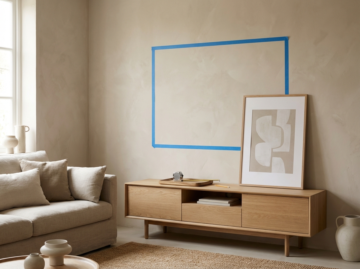
Two-Minute Measuring Method (So You Stop Guessing)
If you’ve ever ordered a print and thought “it looked bigger online,” this method fixes it. You only need a tape measure and (ideally) painter’s tape:
- Measure the target width of the wall area (or the furniture below it).
- Choose a target coverage (50–75% for most situations above furniture).
- Tape the width on the wall using painter’s tape so you can see it at real scale.
- Step back 2–3 meters. If it feels small from that distance, it will feel small forever.
This tiny step prevents the most common regret: ordering a size that doesn’t “hold the wall.” If you want more framing context, read choosing the right size and frame.
Orientation and Aspect Ratio: Match the Wall Shape
Think of the wall as a shape first:
- Wide wall → choose horizontal art (or a triptych / set of three).
- Tall narrow wall → choose vertical art (or a vertical stack).
- Square-ish wall → choose square art (or a balanced grid).
If you’re generating art with AI, decide the orientation early so the composition fits the final crop. For prompt help, use AI wall art prompts that look expensive.
Hanging Height and Spacing (The “Invisible” Sizing Rules)
Even perfect sizes can look wrong if they’re hung too high or spaced inconsistently. Two practical rules:
- Connect art to furniture: above sofas/console tables, keep the bottom edge reasonably close so it feels anchored.
- Keep spacing consistent in sets: 5–8 cm between frames is a common sweet spot.
If you’re building a multi-piece wall, use gallery wall layouts to avoid the “random collage” look.
Living Room
Above a sofa: go wide. One large horizontal print or a triptych often works best. If you prefer multiple pieces, use gallery wall layouts.
Side wall / reading corner: a medium vertical or square print can add focus without dominating.
Common living-room sizes: medium-to-large prints (like 50 x 70 cm, 60 x 80 cm, 70 x 100 cm) often feel right above furniture, depending on wall width. For very wide sofas, a set of two or three pieces can look more balanced than one small print.
Bedroom
Above the bed: aim for calm and balance. A wide piece works well. Keep palette soft; see minimalist AI wall art for bedroom-friendly styles.
Next to wardrobe or door: a vertical stack of two prints is a simple upgrade.
Bedroom tip: choose slightly softer contrast than you would in a living room. Bedrooms benefit from calm palettes and gentle textures (see minimalist prompts and color matching).
Hallway / Entry
Hallways are often narrow, so vertical formats shine. A 2–3 piece vertical stack can guide the eye through the space. Choose matte finishes to avoid glare. For material choices, read canvas vs poster vs fine art paper.
Hallway tip: people view hallway art up close while walking. That means sharpness and clean composition matter. If printing large, use upscaling for large prints to keep edges clean.
Home Office
Office art is viewed closer than living room art, so sharpness matters. If you print large, read upscaling for large prints. For style ideas, read AI wall art for offices.
Office tip: matte finishes reduce glare from screens and lamps. If the art is behind you on video calls, avoid busy micro-details and choose clean midtone compositions.
Kitchen / Dining
Keep it simple and durable-looking. Clean abstracts, botanicals, or minimal landscapes work well. Choose a frame that matches existing finishes (black metal, warm wood). For palette matching, see color matching guide.
Kitchen/dining tip: these rooms often have more direct light and reflections, so matte finishes and simple frames tend to look best long-term.
Bathroom
Bathrooms are tricky due to humidity and reflections. Smaller prints in moisture-safe frames (depending on your setup) can work. Choose calm, minimal compositions that don’t need close inspection.
Bathroom tip: keep sizes modest and compositions simple. If you want a premium feel, choose minimalist textures (plaster, paper grain) and a clean frame.
The “Don’t Regret It” Checklist
- Measure the wall and the furniture below it.
- Pick orientation that matches the wall shape (wide wall → horizontal).
- Decide if it’s one piece or a set (see gallery wall ideas).
- Confirm palette so it belongs (see color matching).
- Check print readiness and upscale if needed (see upscaling guide).
- Choose frame style to match your decor (see size and frame).
Single Print vs Set: How to Decide
Both options can look premium. The best choice depends on wall shape and furniture:
- Choose a single print when the wall is narrow or you want one strong focal point (reading corner, desk wall, small bedroom wall).
- Choose a set when the wall is wide (above a sofa or bed) or when a single piece would need to be very large to feel balanced.
Sets don’t have to be complicated. A simple triptych (three pieces) or a 2x2 grid often looks more “designed” than one undersized print. If you want the easiest layouts, use gallery wall ideas and layouts.
Common Sizing Mistakes (So You Can Avoid Them)
- Hanging too high: even the right size can look wrong if it floats near the ceiling. Keep it visually connected to furniture.
- Choosing art that’s too small for wide furniture: if your sofa/bed is wide, your art group should have width to match.
- Forgetting the frame: frames add visual weight. A thick frame can make a medium print feel heavier; a thin frame keeps things lighter.
- Ignoring glare: bright rooms + glossy finishes = mirror prints. Matte is safer in most homes (see material guide).
FAQ: Choosing Sizes
Should I go bigger or smaller if I’m unsure? If the wall is a statement wall above furniture, going slightly bigger is often safer—as long as you leave breathing room. Use the tape test described above before you commit.
Do different styles need different sizes? Yes. Minimalist art can handle larger sizes because it relies on composition and negative space; busy art can feel overwhelming when huge. If you love minimalist styles, see minimalist AI wall art.
What if I want to fill a huge wall? Consider a set rather than one massive piece. A cohesive set feels curated and is easier to scale across a large wall.
Quick Reference: Starting Sizes by Room (Adjust to Your Wall)
Use these as starting points, then adjust based on wall width and furniture. The “right” size is the one that looks balanced when taped out on the wall:
- Above sofa / bed: start around 60 x 80 cm or 70 x 100 cm (or a 2–3 piece set that totals similar width).
- Above console / sideboard: start around 50 x 70 cm, or two smaller pieces side-by-side.
- Hallway: start around 30 x 40 cm to 50 x 70 cm, often vertical.
- Office: start around 40 x 50 cm to 60 x 80 cm, matte finish preferred.
These are not strict rules—think of them as “common wins.” Use size and frame for deeper framing advice.
Ordering and Delivery in Europe
Once you choose size and frame, preview it live and order. For shipping timelines, tracking, and what to expect, read European delivery guide. If you want extra ordering tips, see custom framed prints in Europe.
Summary
The best size is the one that fits the wall. Measure first, aim for a sensible width coverage above furniture, and use sets when a single print would feel too small. With a good size and frame, your AI art stops being a file—and becomes real wall art.
Most people don’t regret “too big” nearly as often as they regret “too small.” If you’re on the fence, tape out the size, step back, and trust what looks balanced in the room.
Then order once, and enjoy it for years.
Next: Want art that looks premium fast? Start with AI wall art prompts that look expensive and generate a cohesive series for your space.

