
You’ve generated an AI image you love. Now the print decision appears: canvas, poster, or fine art paper? This choice changes how the artwork feels on the wall. The same image can look like a premium gallery piece or like a casual print depending on the material, finish, and frame. In this guide, we’ll compare the most common options (canvas, posters, and fine art papers), explain what they’re best for, and help you choose based on your room, your style, and the specific image you created.
If you’re still creating images, start with AI wall art prompts that look expensive. If you already have the image and you’re deciding dimensions, see choosing the right size and frame.
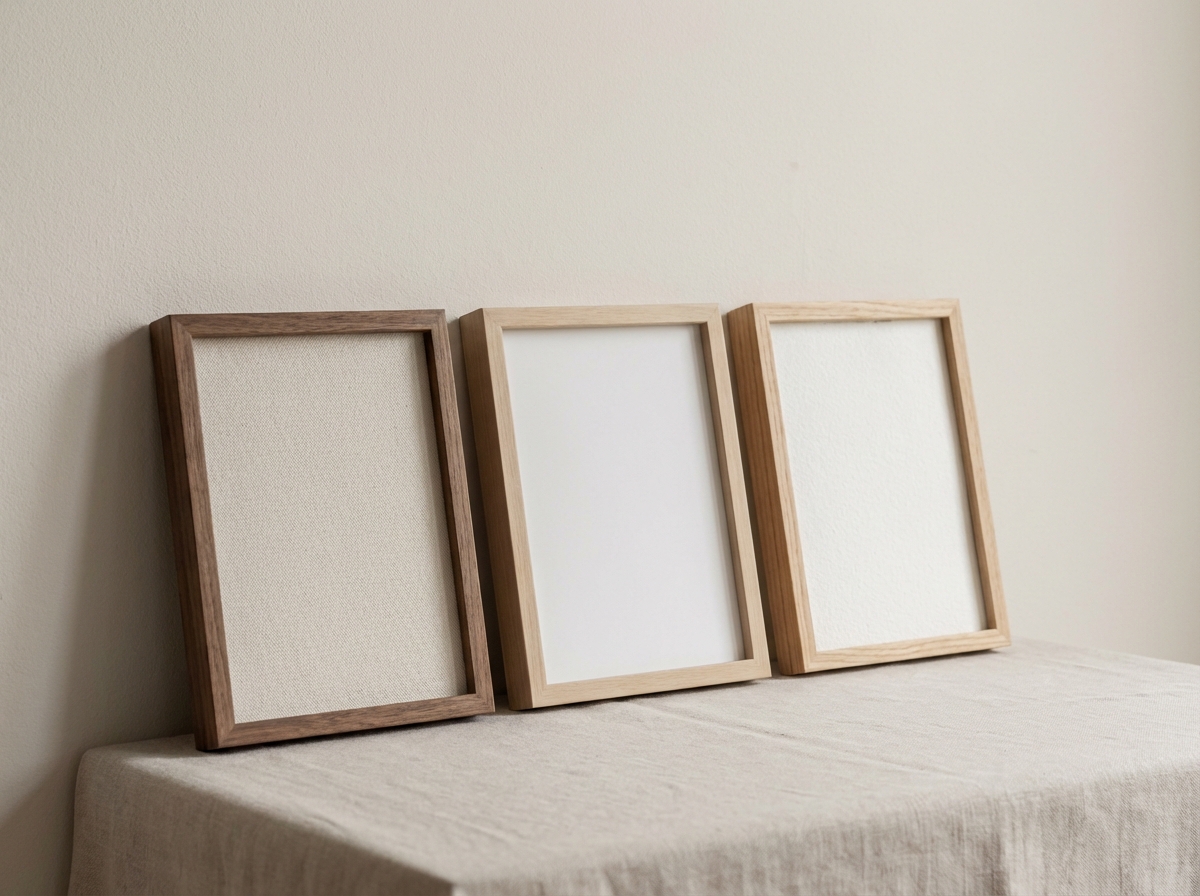
What Matters Most: Texture, Finish, and Viewing Distance
Forget the marketing labels for a moment. For wall art, three factors drive how the print looks:
- Texture: Canvas and textured fine art papers add physical depth; posters are smoother.
- Finish: Matte looks calm and premium; glossy can pop but shows reflections.
- Viewing distance: A hallway print is often seen from closer than a living room statement piece.
Match these to the vibe you want. Minimal abstracts often shine on matte paper in a clean frame. Painterly images can look incredible on canvas because the texture feels “right.”
Option 1: Canvas Prints (Warm, Textured, “Art Object” Feel)
Best for: painterly styles, landscapes, bold statements, and rooms that benefit from warmth.
Canvas adds natural texture. It softens ultra-sharp edges and can make AI images feel more like traditional art. This is perfect for painterly prompts and atmospheric landscapes. It can also be forgiving if your source image isn’t perfectly crisp, because the texture distracts from minor artifacts.
Pros
- Texture hides imperfections and adds depth.
- Feels premium and “object-like,” especially at larger sizes.
- Works well unframed in some styles (gallery wrap), depending on your taste.
Cons
- Fine details can soften, which isn’t ideal for crisp typography or ultra-clean geometry.
- Color can shift slightly depending on coating and canvas base tone.
Tip: If your AI image relies on very clean gradients, read how to upscale AI images for large prints to avoid banding or noise when you scale up.
Option 2: Poster / Matte Print (Clean, Modern, Budget-Friendly Without Looking Cheap)
Best for: minimalist abstracts, graphic designs, clean photography, modern interiors, and gallery walls.
“Poster” doesn’t have to mean flimsy or low quality. A good matte poster print on heavier stock can look excellent, especially when framed. The key is the frame: a clean black/white frame with a modest mat can instantly elevate a simple print.
Pros
- Sharp details and clean edges for modern art and photography.
- Easy to frame and swap over time.
- Great for sets (two or three pieces that match).
Cons
- Shows imperfections more than canvas if your image has artifacts.
- Can feel “flat” if the image doesn’t have strong composition.
If you’re building a multi-piece wall, see gallery wall ideas using AI art for layouts and size mixes that look designed.
Option 3: Fine Art Paper (Gallery-Level Detail, Calm Matte Finish)
Best for: high-quality photography, subtle gradients, delicate illustration, and “quiet luxury” interiors.
Fine art papers (often called giclée papers) can deliver incredible detail and tonal subtlety. They’re ideal when your AI image has nuanced color transitions, soft light, or crisp line work. This is where “expensive-looking” prints often live—especially with a clean frame and a white border or mat.
Pros
- Excellent detail, great for close-up viewing.
- Matte finish reduces glare and feels premium.
- Beautiful for soft palettes and minimalist compositions.
Cons
- Needs a frame to look finished (usually).
- Can highlight banding/noise if the source file is low quality.
Which One Should You Choose? A Room-by-Room Shortcut
- Living room statement piece: canvas (warm) or fine art paper (gallery) depending on style.
- Bedroom calm art: fine art paper (matte) or matte poster in a light frame.
- Hallway / entry: matte poster (easy to refresh) or fine art paper for a clean look.
- Home office: matte poster for modern graphics; fine art paper for photography.
If you want a sizing cheat sheet for each room, see best AI wall art sizes for every room.
Make the Material Match the Image Style
Here’s a practical mapping that works most of the time:
- Painterly / textured prompts → canvas
- Minimalist geometry → matte paper (poster or fine art)
- High-detail photography → fine art paper
- Soft abstracts → fine art paper (matte) or canvas if you want warmth
Finish Matters: Matte vs Satin vs Gloss (A Quick Guide)
Material is only half the story—finish determines how the print interacts with light. In real rooms, glare can ruin a piece. Here’s the fast breakdown:
- Matte: calm, premium, low glare. Best for most wall art, especially bedrooms and offices.
- Satin / semi-matte: slightly more punch in color, still controlled reflections. Good if you want a bit more contrast without full gloss.
- Gloss: high pop, but reflections are real. Only choose if you know the wall lighting is soft and you want a very modern “photo print” look.
If your print will face a window or sit under bright lamps, matte is your friend. Offices in particular benefit from matte because screens already create enough visual brightness. For office-specific decor choices, see AI wall art for offices.
Framing: The Upgrade That Makes Any Print Look More Expensive
Even a simple poster can look premium with the right frame. The keys are restraint and proportion:
- Thin frames feel modern and light; thicker frames feel classic and cozy.
- White borders / mats create breathing room and instantly make a print feel like a gallery piece.
- Match one element in the room (black accents, warm wood, metal fixtures) so the frame belongs.
If you want a step-by-step way to choose frame style and avoid “frame too heavy / print too small,” use choosing the right size and frame.
Durability and Care: What Holds Up Over Time
Most people assume “canvas is durable” and “paper is fragile.” In practice, durability depends on how the print is finished and framed. Canvas can handle life well, but it can be dented if knocked. Fine art paper is protected beautifully behind a frame. Matte finishes hide fingerprints better than glossy. The simplest durable setup is: matte paper + good frame + protected front. If you have kids, pets, or a busy hallway, that protection matters more than the base material.
Budget Strategy: Where to Spend (and Where Not To)
If you want “premium” without overspending, prioritize:
- Composition and palette (the image itself). Use prompt templates that look expensive to get the art right first.
- Frame quality (the finish). A good frame can elevate a mid-range print.
- Right size (so it doesn’t look lost). Use sizes by room if you’re unsure.
You can save by choosing fewer, larger pieces instead of many small ones that feel cluttered. Or choose a cohesive set for a gallery wall (see gallery wall ideas) so your wall feels designed with a limited number of prints.
FAQ: Choosing a Print Material
What should I choose for minimalist art? Matte paper (poster or fine art) with a simple frame usually looks best. Minimalist art relies on clean edges and calm finish. For prompt ideas, see minimalist AI wall art prompts.
What should I choose for painterly landscapes? Canvas adds texture and warmth that suits painterly styles. Just keep composition simple so the texture enhances instead of distracting.
Do I need to upscale for fine art paper? If you’re printing large or your image has subtle gradients, yes. Read how to upscale AI images for large prints.
Don’t Forget: Size and Frame Complete the Look
Material is only one piece of the “premium” equation. The frame and size turn a print into wall art. Use choosing the right size and frame to avoid common mistakes like “too small above a sofa” or “frame too heavy for the art.”
Shipping in Europe: What to Expect
Ordering prints to Europe typically takes a few business days after dispatch; for the full breakdown, read European delivery: how long it takes and what to expect.
Quick Decision Table (If You Want to Choose in 30 Seconds)
- Want warmth + “art object” feel? Choose canvas.
- Want clean modern sets and easy swaps? Choose a matte poster and frame it.
- Want the most “gallery” look and crisp detail? Choose fine art paper with a simple frame and (optionally) a white border.
- Have lots of daylight/glare? Prefer matte finishes.
- Printing large? Read upscaling for large prints first.
Summary: The Fast Decision
If you want the simplest rule: choose canvas for warmth and painterly texture, choose matte poster for clean modern sets, and choose fine art paper when you want crisp detail and a gallery finish. Then pick a size and frame that fits the wall, preview it, and order.
Next: If you’re going large, read how to upscale AI images for large prints so your final piece stays sharp and smooth.

