
Great wall art doesn’t just look good—it looks like it belongs. That “designer” feeling usually comes from color. When the artwork palette matches the room’s tones (even loosely), the space feels curated. When it clashes, the print can feel like an afterthought. The good news: because you’re generating art with AI, you can design the palette on purpose. This guide shows you how to match AI wall art colors to your room using simple rules and prompt techniques.
If you need prompt templates first, start with AI wall art prompts that look expensive. If you’re aiming for calm modern interiors, read minimalist AI wall art too.
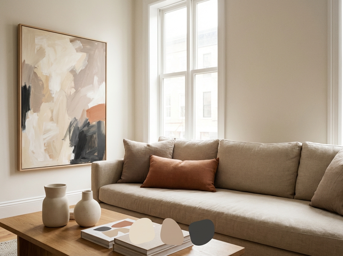
Step 1: Identify Your Room’s “Base Neutrals”
Most rooms have a base neutral family, even if they don’t look neutral at first glance. Look at the largest surfaces: walls, sofa, rug, curtains. Are they warm (beige, cream) or cool (grey, blue-grey)? Write down two base neutrals and one dark anchor (like charcoal, black, deep navy, dark wood).
Step 2: Decide What Role Your Art Should Play
Art can do one of three jobs:
- Blend: same palette as the room (calm, safe, minimalist).
- Bridge: connects two colors in the room (ties everything together).
- Accent: introduces one new color on purpose (statement).
Choose the job first. Then you can generate art that performs that job.
Step 3: Build a Simple Palette (2–4 Dominant Colors)
For wall art, fewer colors usually look more premium. Use:
- 2 neutrals from the room (warm or cool)
- 1 accent from the room (like olive, terracotta, dusty blue)
- Optional dark anchor (charcoal/black/navy) for contrast
Then put that palette into your prompt. This is the easiest way to make AI art feel made for your space.
The 60–30–10 Rule (A Simple Way to Avoid Color Chaos)
Interior designers often rely on the 60–30–10 rule: 60% dominant color (usually walls), 30% secondary (sofa/rug), 10% accent (small objects). Your wall art can support this rule in two ways:
- Blend or bridge: use the 60% + 30% colors so the art feels integrated.
- Accent: borrow the 10% accent color so the art becomes the “hero” that ties accent objects together.
This is why limiting your AI prompt palette works so well: it mirrors how rooms already behave.
Hue vs Tone: Matching “Warmth” Matters More Than Matching Exact Colors
You don’t need your art to match your sofa exactly. Most of the time, you just need the tone temperature to match: warm neutrals with warm neutrals, cool greys with cool greys. A room with warm beige walls will fight an icy blue-grey print, even if both are “neutral.” When you prompt, include a temperature cue like “warm neutral” or “cool grey” so the AI lands in the same family.
How to “Pull Colors” From Your Room (Without Overthinking)
If you’re not sure what your room’s palette is, use this quick method:
- Choose one reference: your rug, your curtains, or your sofa.
- Pick two neutrals: one light (warm white / off-white) and one midtone (sand / light grey).
- Pick one accent: a color that appears in small repeats (cushions, books, plant pots).
- Pick one anchor: charcoal / black / deep navy / dark wood.
Then literally list those colors in the prompt. AI responds very well to explicit palette constraints.
Prompt Pattern: “Palette First” (Works for Any Style)
Use this template when you want the art to match your room:
“[Style/subject], limited palette of [neutral 1], [neutral 2], [accent], optional [anchor], soft lighting, balanced composition, negative space, premium wall art, print-ready.”
After you generate a few options, keep the best composition and iterate only on the palette until it feels right.
Two “Safe” Color Strategies for Almost Any Home
- Neutral base + one accent: warm white + sand + charcoal + one accent (olive/terracotta/dusty blue).
- Monochrome with texture: black + off-white + subtle paper grain or plaster relief.
Both strategies look intentional and are easy to repeat across multiple pieces for a gallery wall (see gallery wall ideas).
Prompt Examples: Matching Common Interior Styles
Scandinavian / Light Neutral
“Minimal abstract artwork, warm white + sand + light grey palette, subtle linen texture, soft diffuse light, calm mood, lots of negative space, gallery print.”
Modern Grey / Black Accents
“Geometric minimalist art, cool grey + off-white palette, charcoal accents, crisp edges, modern poster style, balanced composition, negative space.”
Earthy / Warm / Natural Wood
“Abstract landscape suggestion, warm beige + clay + olive palette, soft haze, gentle texture, calm mood, premium wall art, wide composition.”
Coastal / Blue-Grey
“Minimal ocean horizon, muted blue-grey palette, soft morning light, airy feel, fine art photography style, wide composition, subtle grain.”
How to Use Frames to Help Color Matching
Frames are part of the palette. A black frame adds contrast and modern edge. A white frame softens and blends. Natural wood warms. If your artwork color is slightly off, the right frame can fix it. Use choosing the right size and frame as a guide, then consider this simple mapping:
- Warm rooms → natural wood or warm white frames
- Cool rooms → black, white, or thin metal frames
- Bold rooms → black frame to anchor, or match an existing metal finish
Common Color-Matching Mistakes (and How to Fix Them)
- Too many saturated colors: reduce to 2–4 colors and add a neutral. “Vibrant” is rarely what you want for wall art that feels premium.
- Warm/cool conflict: if your room is warm (beige, wood), avoid icy greys. If your room is cool (grey, steel), avoid overly yellow neutrals unless you want contrast on purpose.
- Accent color appears only once: if the art introduces a new accent, repeat it somewhere else (cushion, vase, throw). Repetition creates intention.
- Contrast mismatch: a very high-contrast black/white print can overpower a soft neutral room. If you want monochrome, choose softer contrast or add texture cues in the prompt.
Room Scenarios: Quick Guidance
Neutral room feels “flat”: introduce one accent color (olive/terracotta/navy) in the art and repeat it in small decor objects.
Colorful room feels chaotic: choose art that blends—use mostly neutrals and pick one color from the room as the only accent.
Modern room with black accents: a black frame and a print with charcoal anchors will instantly feel cohesive, even if the artwork uses soft neutrals.
Pre-Order Checklist
- Palette chosen: 2 neutrals + 1 accent (+ optional dark anchor).
- Role chosen: blend / bridge / accent.
- Frame chosen: matches one existing finish in the room.
- Finish chosen: matte if glare is likely.
When You Want a Statement Piece (Without a Clash)
If you want the art to introduce a new color, pick one accent and repeat it somewhere else in the room: a cushion, a vase, a throw, a book spine. That repetition makes the statement color feel intentional. The art becomes the “hero,” and the room supports it.
Make It Print-Ready
Color matching looks best when the print quality is good. Choose a material that suits your style (see canvas vs poster vs fine art paper) and make sure your file holds up at size (see upscaling for large prints).
Use a Cohesive Set for Instant “Designed” Feel
If you’re decorating a big wall, a matching set often looks better than one random statement piece. Use gallery wall layouts and generate three pieces in the same palette.
FAQ: Matching Wall Art to Your Room
What if my room has multiple colors? Choose one dominant family (warm or cool) and treat the rest as accents. Your art should connect the largest surfaces first; smaller colors can appear as a single accent in the print.
Should the art match the wall color? Usually, no. If the art matches the wall too closely, it can disappear. A small amount of contrast (via darker anchor, frame, or accent) helps the piece stand out while still belonging.
How do I make a statement piece without clashing? Choose one new accent color only, and repeat it elsewhere in the room. This “echo” makes the statement feel intentional instead of random.
What’s the easiest palette for beginners? Warm white + sand + charcoal + one accent (olive or terracotta). It works in most homes and looks premium because it’s restrained.
Quick test: after generating an image, place it next to a photo of your room and look at it in grayscale as well as color. If the tones (light/medium/dark) feel compatible, the print will almost always look cohesive once framed.
Summary
To match AI wall art to your room: identify base neutrals, choose whether the art blends/bridges/accents, constrain the palette in your prompt, and use frames as part of the color strategy. With AI, you can design the palette on purpose—and your room will feel curated as a result.
It’s the fastest way to make new art look like it was always meant to be there.
Next: If you’re ordering in Europe, read custom framed prints in Europe: ordering guide to avoid common surprises with shipping and returns.

