
Your home office doesn’t need a full renovation to feel good. One or two well-chosen prints can make the space feel intentional—more like a studio and less like a temporary desk. AI wall art is especially good for offices because you can generate art that matches the mood you want (focused, calm, energetic) and the colors you already have (desk, chair, wall). This guide shows you how to choose and generate AI wall art for offices, then print and frame it so it looks designed.
If you need prompt templates, start with AI wall art prompts that look expensive. If you’re unsure how to match the art to your setup, read how to match AI wall art colors to your room.
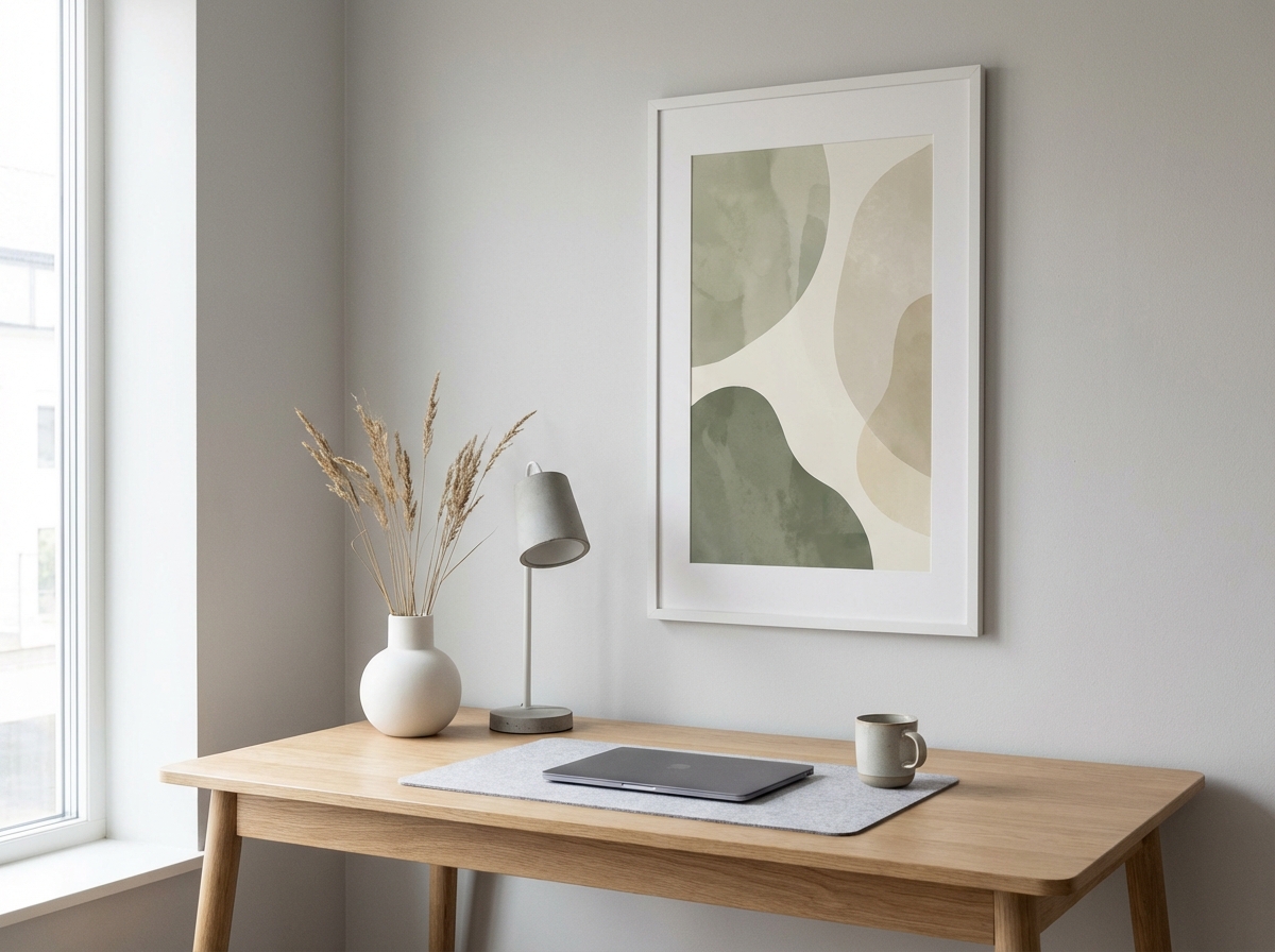
What Office Art Should Do (Function Before Style)
Office art can support focus. That doesn’t mean “boring,” but it does mean avoiding chaotic visuals. As a rule:
- Calm, minimal art reduces distraction and supports deep work.
- Nature and landscapes can lower stress and feel restorative.
- Bold graphics can energize—better for creative work than for heavy concentration.
If you want calm modern options, read minimalist AI wall art.
Pick Your Office “Mood” (Then Prompt for It)
Choose one mood and build around it:
- Focus: minimal abstracts, soft palettes, negative space.
- Creative: color block geometry, surreal minimal, bolder accents.
- Calm: misty landscapes, botanicals, warm neutrals.
Prompt Ideas for Office Wall Art
Focused Minimal
“Minimal abstract composition, warm neutral palette, subtle paper grain texture, soft light, negative space, calm mood, modern gallery wall art.”
Creative Geometry
“Geometric color block artwork, Bauhaus-inspired, clean edges, modern poster design, limited palette of [two colors] + neutral, balanced composition.”
Nature Calm
“Atmospheric landscape, muted blue-grey palette, soft morning light, minimal details, calm mood, fine art print style, wide composition.”
More Office Prompt Variations (So It Matches Your Work Style)
Once you pick a mood, choose a variation that matches what you do. The trick is to keep the art “readable” from across the room and not visually noisy up close.
Deep Work (Very Calm)
“Minimal abstract, warm white + sand + charcoal palette, extremely subtle texture, soft diffuse lighting, large negative space, quiet luxury aesthetic, print-ready.”
Creative Studio (More Energy, Still Controlled)
“Modern geometric poster design, limited palette of [accent] + neutrals, clean shapes, balanced spacing, Bauhaus-inspired, matte print finish, horizontal composition.”
Nature Reset (Restorative)
“Misty forest landscape, muted greens and warm neutrals, soft morning fog, minimal detail, calm mood, fine art photography style.”
Architecture Minimal (Professional, Editorial)
“Minimal architecture scene, smooth plaster wall, geometric shadows, warm sunlight, monochrome neutral palette, fine art photography, vertical composition, negative space.”
Monochrome Ink (Sharp and Clean)
“Minimal ink wash abstract, black + off-white palette, subtle paper grain, soft gradients, calm composition, square format, gallery print.”
Video Call Backgrounds: Make It Look Good on Camera
If the art sits behind you on video calls, you’re effectively designing your “brand” backdrop. A few rules help:
- Avoid micro-details: busy textures can shimmer or look messy on webcams.
- Prefer midtones: very dark art can create a “hole” behind you; very bright can steal attention.
- Keep the subject simple: one calm focal element is ideal.
- Frame matters: thin black/white frames read cleanly on camera.
If you want a minimalist style that almost always works for backgrounds, see minimalist AI wall art.
The Two-Print Office Set (Fastest “Designed” Upgrade)
If your office has two visible walls, a set of two prints often looks better than one. Use the same palette and frame color, then vary composition. Example:
- Print 1 (anchor): minimal abstract with stronger contrast.
- Print 2 (support): calmer variation with more negative space.
For sizing guidance by wall type, use sizes by room. For frame guidance, use size and frame.
Common Home Office Art Mistakes (and Fixes)
- Too small above the desk: tape out the width first and aim for a confident size.
- High glare: choose matte finishes and avoid glossy prints (see material guide).
- Art clashes with setup: constrain the palette in prompts using your desk/chair/wall tones (see color matching).
- Looks soft up close: upscale before printing large (see upscaling guide).
Office Art Checklist (Before You Order)
- Mood chosen: focus / creative / calm.
- Palette constrained: 2 neutrals + 1 accent max.
- Finish chosen: matte to reduce glare.
- Size planned: tape test on the wall if you’re unsure.
Where to Place Art in a Home Office
- Behind your desk (video calls): choose calm, simple art that reads well on camera.
- Side wall: this is your “personal” art zone; you’ll see it often while working.
- Above a shelf: small or medium prints add polish without dominating.
For size planning, use best AI wall art sizes by room and size and frame guide.
Print Material: What Works Best for Offices
Matte finishes are ideal for offices because they reduce glare from screens and lamps. Fine art paper or matte posters usually work best. If you’re deciding between options, read canvas vs poster vs fine art paper.
Lighting and Glare: The Office-Specific Problem
Home offices tend to have direct light sources: desk lamps, screens, and sometimes overhead LEDs. That’s why glossy prints are risky in offices—they can turn into mirrors. If your desk faces a window, glare can be constant throughout the day. To keep your wall art looking good in all conditions:
- Prefer matte finishes.
- Avoid placing glossy art opposite windows.
- Use midtone art (not extremely dark, not extremely bright) so it reads well under mixed lighting.
This is also why minimalist art works so well in offices: controlled contrast and calm palettes look good under many lighting setups.
Make Sure It Looks Sharp (Especially on Camera)
Office art is often closer to you than living room art. If you print large, follow how to upscale AI images for large prints so lines and edges look clean.
Ordering in Europe
For delivery expectations and tracking, read European delivery guide. If you want additional ordering tips, see custom framed prints in Europe.
Three Office Wall Setups (Pick One)
Setup 1: The “Clean Background” (Best for Remote Work)
One medium-to-large print behind you, minimalist palette, thin frame. This looks professional on camera and doesn’t distract you during focus sessions. Use a prompt from the “Deep Work” section and keep contrast moderate.
Setup 2: The “Creative Corner” (Best for Makers and Designers)
Two prints on the side wall: one energetic geometric, one calmer support. Keep the same palette and frame color so it reads as a set. If you want layout ideas beyond two pieces, borrow a simple arrangement from gallery wall layouts.
Setup 3: The “Nature Reset” (Best for Stress Reduction)
One landscape or botanical piece placed where your eyes rest when you take a break (not directly behind the monitor). This turns micro-breaks into real resets and keeps the room feeling calm.
FAQ: Office Wall Art
Should office art be motivational text? Usually no. Text-heavy art tends to look cheaper and it can be distracting. If you want meaning, use symbolism (a landscape, a shape, a calm architectural shadow) instead of literal quotes.
Can I use very bold colors? Yes, but keep it to one accent color and repeat it elsewhere (a notebook, a lamp, a cushion). Use color matching so the accent feels intentional.
Is one big piece better than many small ones? In offices, often yes. One well-sized piece reads cleanly and reduces visual clutter. If you do multiple prints, keep spacing consistent and frames matching.
What’s the simplest way to make it look premium? Matte finish, restrained palette, correct size, and a simple frame. Most “cheap-looking” offices fail on one of those four.
One Last Tip: Choose Art That Supports Your Work
Workspaces are different from living rooms: you spend hours there. Art that looks exciting for five minutes can feel tiring after five weeks. If you’re unsure, choose calmer art and add energy through small accents instead. For calm prompt options, see minimalist AI wall art.
Summary
Office wall art should support the way you work. Choose a mood (focus, creative, calm), generate art that matches your palette, print on a matte finish, size it for the wall, and frame it simply. With one good piece, your home office feels designed—without overthinking it.
If you’re stuck, choose the “Focused Minimal” direction, pick a neutral palette, and order one confidently sized print. You can always add a second matching piece later once the first one proves the style in your space.
That “one good print” approach is the fastest way to make a workspace feel permanent and intentional—especially if you work there every day, year after year.
And when your office feels good, work feels a little easier—for you too, every day.
Next: Want to turn a personal photo into wall art? Read photo to AI wall art: turn travel or family photos into print-ready art.

