
Minimalist art is one of the safest ways to make a room feel more expensive. It doesn’t fight your furniture, it plays well with neutral interiors, and it stays calming over time. AI can generate minimalist wall art quickly—but only if you prompt for restraint. This guide shows you the styles and palettes that work best, plus prompts that produce calm, print-worthy results that won’t look busy or “AI-random.”
If you want general prompt templates first, see AI wall art prompts that look expensive. If you’re planning multiple pieces, read gallery wall ideas using AI art.
What Makes Minimalist Art Feel Premium
Minimalism isn’t “empty.” It’s controlled. Premium minimalist wall art usually has:
- Negative space (breathing room).
- A simple focal idea (one shape, one gesture, one horizon line).
- A limited palette (often neutrals with one accent).
- Subtle texture (plaster, paper grain, linen, soft brushwork).
Palettes That Work in Most Homes
Pick one of these and reuse it across multiple pieces for a cohesive wall:
- Warm neutrals: beige, sand, cream, soft taupe, charcoal.
- Cool calm: soft grey, off-white, muted blue-grey, deep navy accent.
- Earthy modern: clay, terracotta, warm white, olive accent.
- Black & white: crisp contrast, editorial feel (works best with strong composition).
If you’re unsure how to match art to your room’s colors, read how to match AI wall art colors to your room.
Minimalist Styles That Print Well
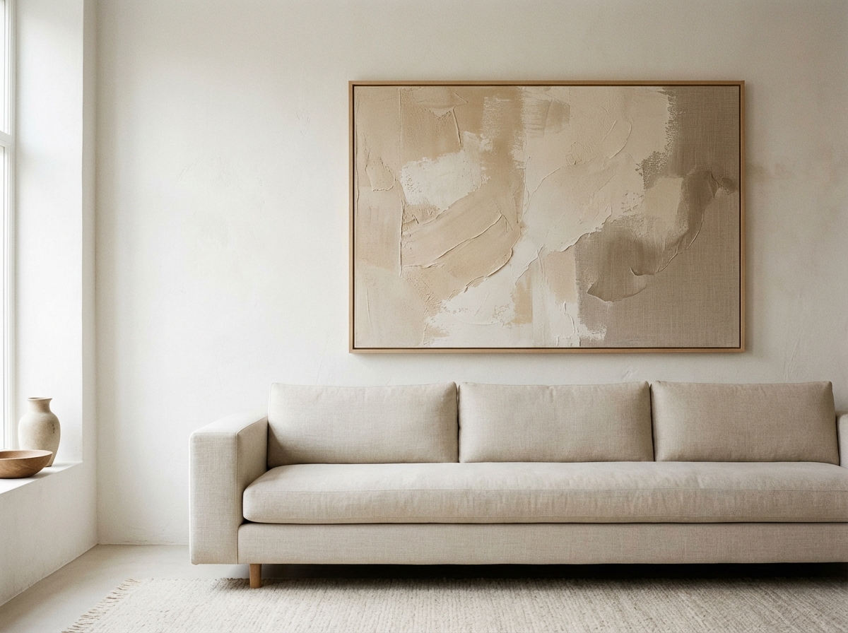
1) Plaster / Stucco Texture Abstracts
These look like “quiet luxury” art. They print beautifully on matte paper and also work on canvas.
2) Minimal Landscapes
Soft horizon lines, misty shapes, gentle light. Great for bedrooms and living rooms.
3) Line Art / Single Stroke
Clean linework with lots of empty space. Needs good sharpness, so consider reading upscaling for large prints if printing big.
4) Color Block Geometry
Modern, graphic, and easy to make into sets.
Prompt Templates for Minimalist AI Wall Art
Copy and adjust the brackets. Keep prompts short and consistent.
Plaster Texture
“Minimal abstract plaster texture, warm neutral palette, subtle relief, soft side lighting, calm mood, lots of negative space, gallery wall art, high-end interior style, vertical composition.”
Misty Landscape
“Minimal misty landscape, soft fog layers, muted blue-grey palette, gentle morning light, wide composition, minimal details, calm and quiet mood, fine art print style.”
Single Line Art
“Minimal continuous line drawing of [subject], clean off-white background, thin charcoal line, balanced composition with negative space, Scandinavian poster style, vertical composition.”
Soft Color Blocks
“Geometric color block artwork, Bauhaus-inspired, warm beige + clay + charcoal palette, clean edges, minimal texture, balanced spacing, modern poster design, horizontal composition.”
Minimal Architecture Shadows
“Minimal architectural wall, smooth plaster texture, geometric shadow shapes, warm sunlight, monochrome warm neutral palette, fine art photography style, lots of negative space, vertical composition.”
Botanical Minimal (Soft and Timeless)
“Minimal botanical illustration of [plant], delicate linework, gentle shading, off-white background, muted earthy palette, Scandinavian poster style, calm mood, vertical composition.”
Monochrome Ink Wash
“Minimal ink wash abstract, black + warm white palette, soft gradients, subtle paper grain, quiet luxury aesthetic, balanced composition, square format.”
How to Turn One Good Minimal Prompt Into a Whole Collection
Minimalist walls often look expensive because they feel cohesive. You don’t need ten unrelated artworks—you need a small collection that shares a visual language. Once you find one prompt that produces a piece you love, treat it as your “style seed” and generate variations by changing only one variable at a time:
- Composition: centered vs off-center vs large negative space.
- Palette: keep the same neutrals, swap one accent (e.g., terracotta → olive).
- Texture: linen → plaster → paper grain (subtle differences feel intentional).
- Orientation: generate one vertical, one horizontal, one square for flexible placement.
This approach creates a “family” of prints that belong together without looking duplicated. If your goal is a multi-piece wall, also read gallery wall ideas and layouts for the easiest arrangements.
Minimalist Art by Room: What Works Best
Minimalist art is versatile, but certain styles fit certain rooms better:
- Bedroom: low-contrast abstracts, misty landscapes, warm neutrals. Avoid harsh black/white unless your bedroom is very modern.
- Living room: one stronger anchor piece (higher contrast) plus quieter supports. A triptych works well above a sofa.
- Hallway: vertical line art or architectural minimal. Keep details simple so it reads quickly while walking.
- Home office: calm geometry and muted palettes reduce visual distraction. See office wall art guide.
If you’re unsure how to make the palette match your interior, use how to match AI wall art colors to your room. For sizing, use sizes by room.
Common Minimalist Prompt Mistakes (and Fixes)
- “Minimal” but still busy: add “single focal point,” “minimal background,” and “generous negative space.”
- Too flat: add “soft side lighting” and “subtle texture.”
- Colors feel wrong: explicitly list 2–4 colors in the prompt and remove “vibrant” language.
- Looks like a generic poster: add “fine art print” and specify a medium (paper grain, plaster relief, linen texture).
A good minimalist prompt isn’t short because it’s vague—it’s short because it’s specific. It tells the AI exactly what to keep and what to remove.
Printing Minimalist Art: Material and Finish Tips
Minimalist art often depends on subtle tones and clean edges, so the print finish matters. In most homes, matte is the safest choice because it reduces glare and feels premium. Fine art paper is excellent for delicate gradients and linework, while canvas can add warmth and texture (especially for plaster-like abstracts). If you want the full comparison, read canvas vs poster vs fine art paper.
If you plan to print large, make sure your file holds up. Minimal gradients can show banding when enlarged, so follow how to upscale AI images for large prints before ordering your biggest size.
FAQ: Minimalist AI Wall Art
Should minimalist art be monochrome? Not necessarily. Many high-end minimalist pieces use warm neutrals or soft muted colors. Monochrome works best when composition is strong.
How do I make minimalist art feel less “empty”? Add subtle texture, gentle contrast, or a single accent shape. “Empty” becomes “intentional” when there’s a clear focal idea.
Can I build a minimalist gallery wall? Yes—minimalism is one of the easiest styles to turn into a cohesive set. Use gallery wall layouts and keep palette + frames consistent.
How to Avoid “Empty but Boring”
Minimal art can fail if it has no visual tension. Add one of these:
- Texture (paper grain, plaster relief, subtle brush).
- Contrast (one darker accent against neutrals).
- Asymmetry (focal point off-center).
- Scale (a large shape with lots of empty space around it).
Printing and Framing for Minimalist Art
Minimalist prints look best when the finish is calm. Matte paper + simple frame is a classic. If you’re choosing between materials, read canvas vs poster vs fine art paper. Then use choosing the right size and frame to avoid sizing mistakes that make minimalist art look lost on the wall.
Want a Set? Build a Calm Gallery Wall
Minimalist art is perfect for a gallery wall. Use gallery wall layouts and generate a cohesive series with one palette.
Minimalist Ordering Checklist (So It Looks Premium on the Wall)
Minimalist art is unforgiving: small sizing mistakes and inconsistent frames show up immediately. Before you order, run this checklist:
- Pick the wall first: decide where it will hang and whether the wall wants a horizontal, vertical, or square piece.
- Choose the role: blend (calm), bridge (ties colors together), or accent (one bold color). If you’re unsure, use color matching.
- Lock the finish: matte is usually best for minimalist prints because it reduces glare and feels calm.
- Frame consistently: one frame color across the set is the easiest premium look. Thin black, white, or natural wood are safe.
- Size with intent: don’t order too small. Use sizes by room and the 50–75% rule above furniture.
- Check sharpness: if you’re printing large, follow upscaling for large prints to avoid softness and banding.
Finally, preview your final product (size + frame) before ordering. That last step is what turns “a nice image” into “a finished piece of wall art.”
Summary
Minimalist AI wall art looks premium when it has negative space, controlled palette, and subtle texture. Use prompts that constrain the style, then print on a calm finish and frame simply. The result is art that makes a room feel finished—without shouting for attention.
If you want the easiest first win, generate one minimalist piece in a neutral palette, print it at a confident size, and frame it simply. That single upgrade often makes the whole room feel more put together—and it gives you a “style reference” for any future pieces you add, so everything stays cohesive.
Then, when you’re ready, add a second piece in the same palette and frame to create a subtle “set” without needing a full gallery wall.
Next: To make any style work in your exact interior, read how to match AI wall art colors to your room.

